Day 51: Protecting the public from epidemiological data
It is rather astonishing here how much of the data I and others collect cannot be shared. It is not that the data is about things people don’t know. It is not that the data is about secret findings… it is about keeping the press and academics from saying stupid things and attributing it to WHO.
We have done a series of sensitivity analyses of the major CDC created surveillance system, the VHF, that everyone knows is incomplete. It is consistently 10 or 20% lower than the weekly district reports probably because somehow 10 or 20% of cases fail to be properly documented and transferred on through the steps of the surveillance process (e.g. the case report does not get filled out, or gets lost, or gets missed at the data entry office on the district level….or because half the freakin’ country have one of about six first and last names so they see 17 people named Mohammed Kumara from that district and think that their Mohammed Kumara has already been entered…). But, say out loud with data what everyone knows, for example that most of the cases are not being detected, and wow do the cheap seats in Atlanta and New York start rattling.
The most stunning censorship is the reluctance of anyone to show the epidemic curve. This is because the data takes time to get into the system (both the CDC VHF system and the MoHS “call to the Districts every day” system). It takes days for suspect cases to be tested and confirmed or sent home. It takes days for the data to get entered into the database. There are all kinds of delays… that when presented as an Epi curve, constantly give the impression that the outbreak has peaked and is coming down over the last two weeks.
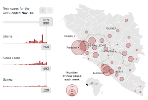
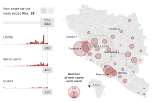
Above is an example from New York Times of an apparent drop off in cases, but not a true one. It is due to counting errors.
(The original image was missing) This is mostly based on the MoHS data so the dip is not as dramatic as the VHF database. Most every reporter and fancy-pants modeler that has never done contact tracing or data entry form hospital forms will be tempted to report that the outbreak appears to be going down. This is actually what going up looks like. It would be fine if poorly informed people misinterpreted and then moved on to the crossword puzzle, but more often, the press officer and we in the office need to squander time explaining about data flow and delays. And then there are aberrant events.
If one looks at the week of September 21 above, it looks like there was a spike in suspected cases and then a dip. In fact, there was an outbreak of coding errors combined with the largest lab near Port Loko (the district with the highest incidence) shutting down for the week. Thus, those suspected cases from the week of September 21 mostly died without ever being laboratory confirmed and thus they will stay suspect forever. Since back in September, it took 4 or 5 days to get a lab test back (it is much shorter now), and then the data record had to be updated, typically cases that appeared as suspect in the week of Sept. 21 would mostly change to confirmed in the week of Sept. 28, but that never happened that week resulting in an artifact of apparently elevated numbers of suspect cases one week and fewer cases the next. There are issues like this or bigger in every data source I see every day… so people just do not share data and findings… not with the press, not with your peers who might share it with the press, and heaven knows not with Geneva!
Ah, the things they don’t teach you in intro Epi!
Les

